Le Frenchy Studio
Sensifi

Brand Identity · Logo Design

Client
Sensifi
Mobile App
Services
Logo Design
Brand Identity
Tools
Illustrator
Photoshop
Year
2022
Completed
01 · The Brief

A logo built
for the senses.

Sensifi is a mobile app that puts emotional wellbeing at the heart of the user experience. The brief called for a bold, modern logo mark that could stand alone as an app icon while conveying sensitivity, intelligence, and forward motion.

The identity needed to feel human yet tech-forward, vibrant yet grounded, with a strong visual presence across app stores, interfaces, and marketing materials.

“Bold enough to stop. Subtle enough to feel.”

Brand Direction, Sensifi
1
Distinctive. A mark that is immediately recognisable as an icon in the app store environment.
2
Expressive. Colour and form that communicate emotion, energy, and sensitivity at a glance.
3
Scalable. Works perfectly from a 16px favicon to a full billboard without losing character.
4
Tech-forward. Clean, geometric construction with enough warmth to feel human and approachable.
02 · Brand Identity

The mark,
deconstructed.

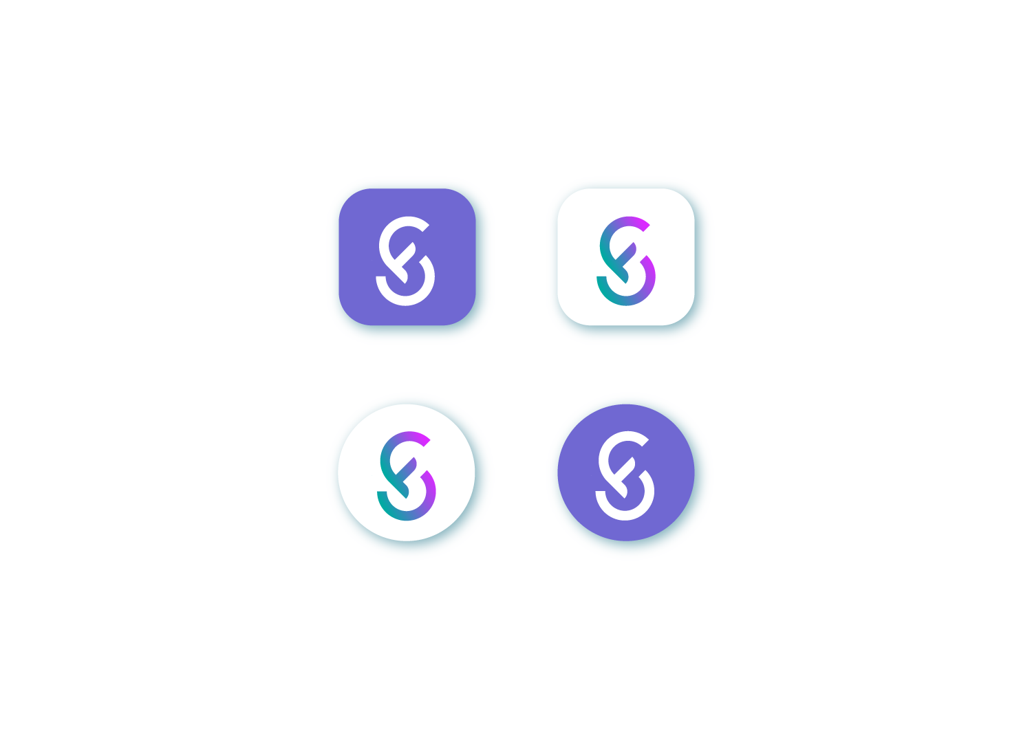
Logo system
Sensifi logo on light
Sensifi logo on dark
Colour palette
Sensifi.
Hex
00aaa2
Green · Primary
S
Sensifi.
Hex
7068d2
Purple · Secondary
i
Sensifi.
Hex
da2aff
Pink · Accent
i

Sensifi brand colours
Sensifi branding
03 · The App

Identity,
in every pixel.

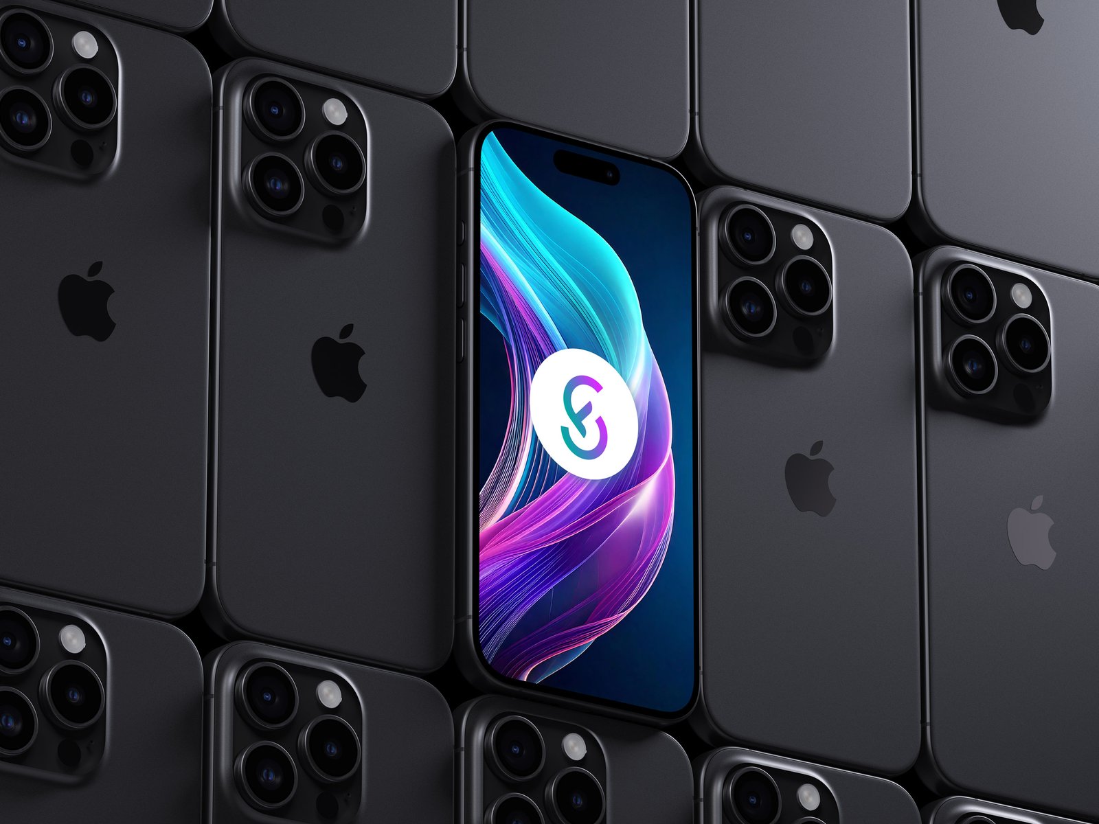
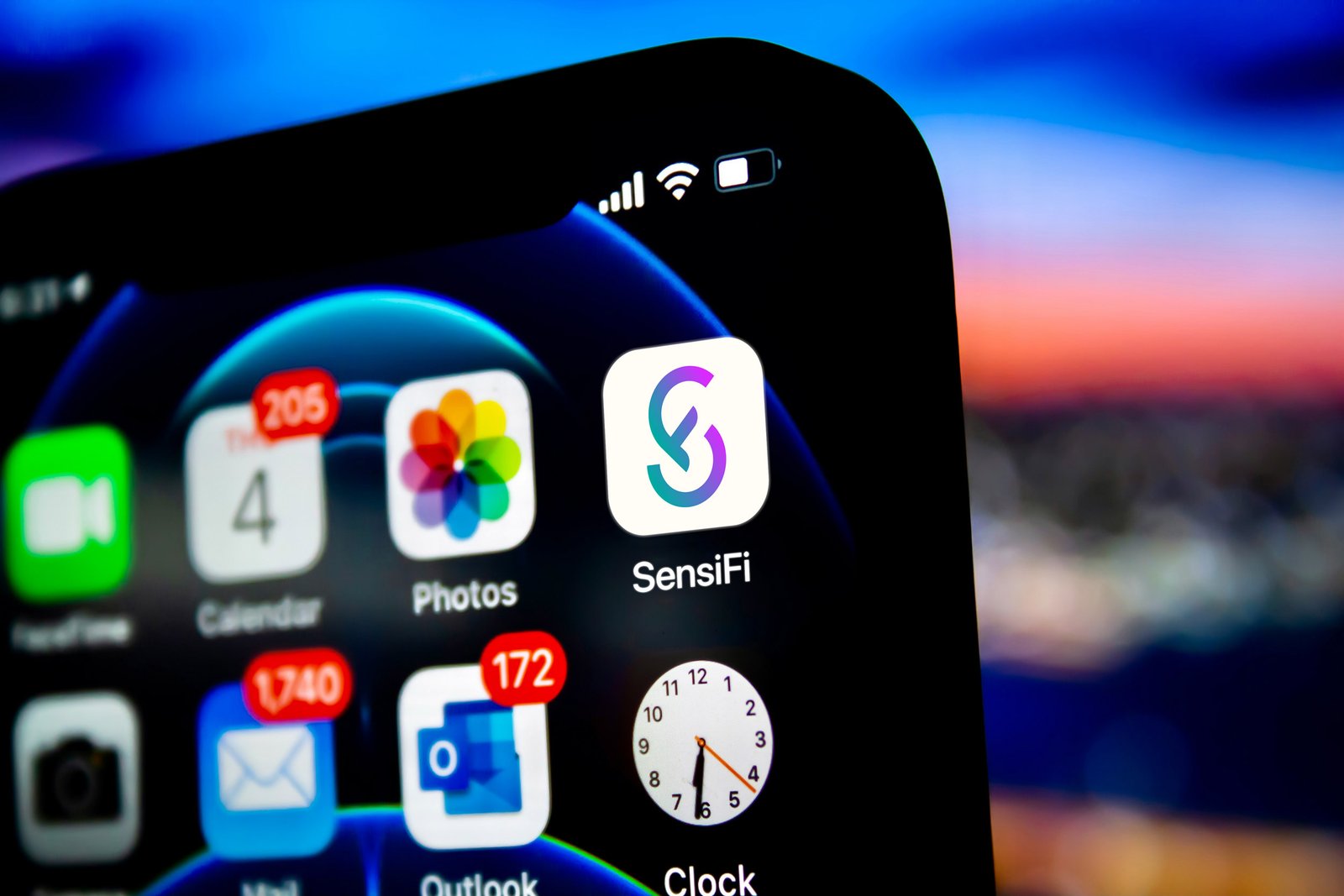
From the app icon on a home screen to the splash screen at launch, the Sensifi identity holds its own across every touchpoint of the mobile experience.
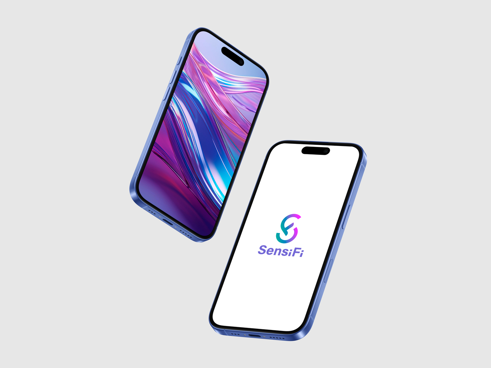
Sensifi mobile mockup
Sensifi iOS app icon
Sensifi on iPhones
Back to projectsNext project →